Businesses Trust Pandora CloudCover for Premium, Ad-Free Background Music Streaming


Why Music Matters in Your Retail Store

Increase dwell time
Research indicates that a 1% increase in dwell time results in a 1.3% increase in sales. Persuade customers to linger, explore, and discover more with a background music solution crafted for retail environments.

Minimize perceived wait times
The average retail customer is only willing to wait 5 to 10 minutes in a checkout line. The right background music makes waits feel shorter, reducing frustration.

Mask unwanted sounds
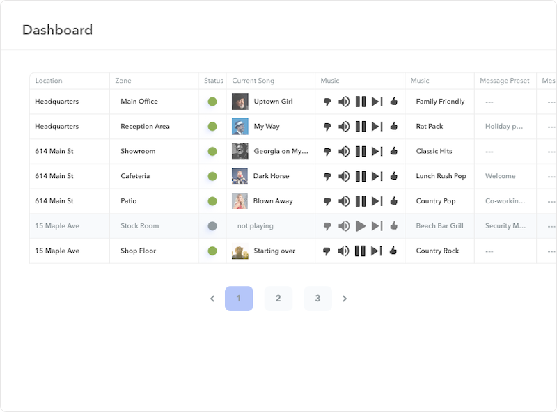
Our intuitive dashboard enables you to make real-time adjustments, controlling volume and reducing noise pollution, while providing customers a seamless shopping experience.

Improve staff morale
Our low-repeat stations create a positive and productive atmosphere with background music designed to uplift, motivate, and energize staff.
Create a memorable experience
Sound has a significant impact on the creation of memories and associations. We help you harness that power to communicate your brand identity and create memorable customer experiences.

Enhance your brand identity
Our stations are custom-curated by expert musicologists who work directly with you to construct a soundscape that communicates your brand identity, allowing you to attract and retain the customers you want.
Why Thousands of Retailers Choose Pandora CloudCover

Pandora CloudCover’s scalable, fully licensed business streaming solution provides retailers the tools to create exceptional customer experiences at a fraction of the cost of competitors.
Our carefully curated stations ensure your brand’s image and values are conveyed seamlessly, while features like simple setup and our centralized dashboard streamline management. Best of all, our month-to-month pricing, along with a free 14-day trial, make getting started easy.
What Customers Say
See How Pandora CloudCover Has Made an Impact

Brooks Brothers Elevates In-Store Experience with Pandora CloudCover Music
We’re excited to announce that Brooks Brothers has selected Pandora CloudCover to provide the perfect background music for their stores!

Music That Fits: Windsor Finds the Perfect Match for In-Store Atmosphere
Windsor Fashion is a fast-growing women’s fashion retailer with more than 230 stores nationwide. The company upgraded to CloudCover's background music and messaging service for all of their locations in under 30 days.

Clark's Nutrition: Gaining Control and Consistency across Multiple Locations
Clark’s Nutrition uses Pandora CloudCover to centrally manage music and audio messages, keeping them consistent across multiple stores.

The Grocery Outlet Store: Values-based, Fully Licensed Music
The Grocery Outlet chose Pandora CloudCover to play music the right way. Licensed, affordable, and easy to manage—plus a sound their customers truly appreciate.
Start Steaming Music in Your Retail Store Today

.webp)


Background Music Solutions for All Retail Environments
Clothing Retail Stores
Embellish the aisles of your clothing retail stores with music that’s as trendy and fashionable as your offerings. CloudCover enables you to set the perfect mood for shopping, adjusting playlists seasonally and ensuring that the ambiance is always supportive, both for your clientele's shopping experiences and your staff’s working environment.
- Trendy, fashionable playlists
- Mood setting for shopping
- Seasonal music adjustments
- Supportive atmosphere for staff

Grocery Stores
Elevate the daily shop with a fresh, welcoming soundtrack from CloudCover, ensuring every journey through your grocery store’s aisles is pleasant and guided by uplifting, positive tunes. Create a shopping experience that customers look forward to, complementing your fresh produce and delightful products with equally delightful melodies.
- Fresh, welcoming playlists
- Enhance shopping experience
- Guided, pleasant journeys through aisles
- Positive, uplifting atmosphere

Warehouse & Big-Box Stores
In the expansive spaces of warehouse and big-box stores, discover how CloudCover crafts vast, enveloping soundscapes that enhance, uplift, and guide the customer experience from aisle to aisle.
- Wide-range soundscapes
- Pleasant shopping
- Enhances large spaces
- Volume consistency

Malls & Shopping Centers
Immerse visitors in cohesive, widespread soundscapes with CloudCover, uniting varied retail experiences within malls and shopping centers under a singular, harmonious auditory umbrella. Manage multiple zones and stores effortlessly, ensuring a consistent, enjoyable atmosphere that blankets the entirety of the shopping center, enhancing every visit.
- Cohesive, widespread soundscapes
- Unite varied retail experiences
- Manage multiple zones effortlessly
- Consistent, enjoyable shopping atmosphere

Automotive Service Centers & Repair Shops
Improve the waiting room experience with licensed background music built for auto repair shops and service centers. Pandora CloudCover helps create a calm, professional environment while customers wait for their vehicles.
- Reduce perceived wait times
- Make service visits feel more comfortable
- Reinforce a trustworthy, professional atmosphere
- Fully licensed and easy to manage

Car Dealerships
Set the tone across your showroom, sales floor, and customer lounge with licensed background music from Pandora CloudCover. The right soundtrack helps customers feel comfortable and confident as they browse and buy.
- Elevate the showroom experience
- Support longer browsing and dwell time
- Create a polished, professional brand feel
- Easily manage music across multiple areas

Car Washes
Create a smoother, more enjoyable visit from start to squeaky clean finish with licensed background music designed for car washes. Pandora CloudCover helps turn a routine stop into a more pleasant experience, even during busy hours.
- Make wait times feel shorter
- Create a consistent, welcoming atmosphere
- Professional sound without ads or interruptions
- Simple setup for high-traffic locations


All music licensing included
License coverage to legally stream background music in your businesses

No ads or interruptions
Your music is never interrupted by unwanted advertisements or DJs

Hundreds of curated stations
Access hundreds of stations spanning every genre, mood, and era

10,000+ Artist Stations
Each artist station captures the essence of the featured musician

Custom stations and mixes
Choose a set of songs or artists, and let Pandora's Music Genome work its magic

Clean family-friendly tracks
Business stations are lyric-checked and rated for explicit language and offensive subject matter
Frequently Asked Questions
Do I need any special equipment to use the CloudCover service?
When I use CloudCover, do I have to worry about song rights, royalties or other licensing issues?
Can I manage multiple locations using CloudCover from a single device or location?
Is there someone I can talk to if I need help or have questions about my service or need technical support?